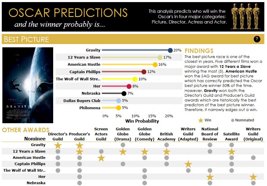
The Academy Awards event was held yesterday here in Los Angeles, and there are those technology diehards who tried to combine the creative arts with data science. For example, Adam McCann of Dueling Data created an interactive dashboard showing predictions for the Oscars based on how well the candidates fared in earlier awards, such as the Golden Globes and the British Academy. You can play with the interactive visualization HERE. See how well the predictions fared by comparing with the actual results. It seems that data analytics is able to touch many areas of society!
Sign up for the free insideBIGDATA newsletter.


Speak Your Mind