
Here is a great interactive visualization app that combines data analytics with March Madness – a match-up guide for the 2014 NCAA Basketball Tournament. Jay Lewis of 64 to 1 developed a Tableau app that lets us quickly compare each of the 68 NCAA tournament teams head to head. Pick your teams to compare their stats. Then switch tabs to see the last 28 years of NCAA brackets, where the teams have to travel this year, or review common metrics in the glossary.
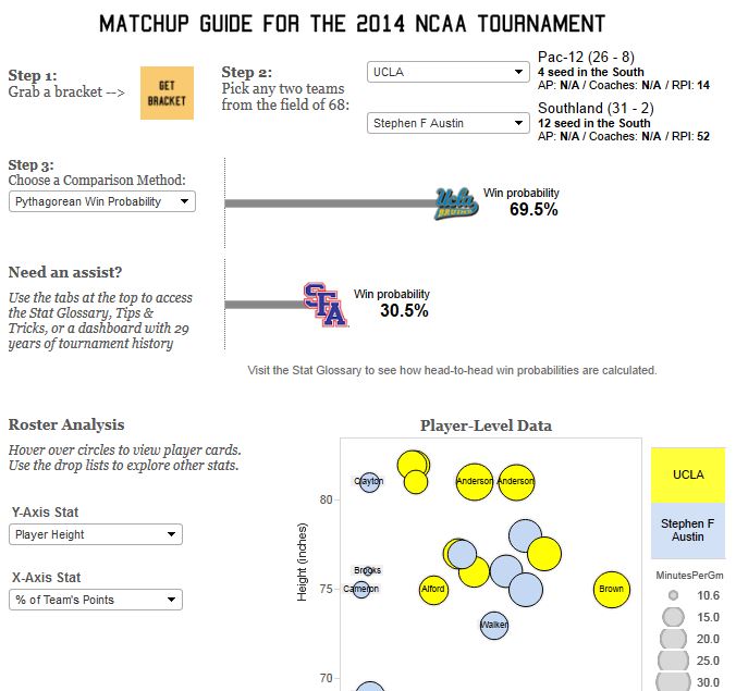
I used the app to see the “Win Probability” metric for my team, the UCLA Bruins, versus an up-start team with a 29 game win-streak – Stephen F Austin. I like the results of the calculation! The two teams go at it tomorrow afternoon. Crossing my fingers that UCLA gets to the Sweet 16 after a 6 year absence. Go Bruins! Use the app to see how your team is predicted to perform.
You can play with the app HERE.
Sign up for the free insideBIGDATA newsletter.


Speak Your Mind