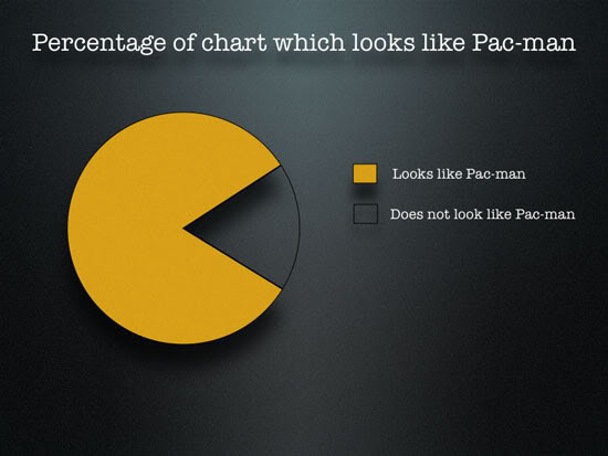
Pie charts are typically deemed the least useful type of plot to data scientists during the Exploratory Data Analysis phase of a machine learning project, but in this case I think it works!
Sign up for the free insideBIGDATA newsletter.
Pie charts are typically deemed the least useful type of plot to data scientists during the Exploratory Data Analysis phase of a machine learning project, but in this case I think it works!
Sign up for the free insideBIGDATA newsletter.

[SPONSORED POST] Organizations can now confidently embrace Elastic, enhance their hot tier storage, and seamlessly manage historical data with cost-efficient capacity-optimized storage. Pure Storage not only meets the demands of the modern data landscape but also empowers organizations to simplify their Elastic architecture, reflecting the industry trend towards a more streamlined and efficient approach.

In today’s fast-paced world, driven by demands for speed and efficiency, the field of clinical development has undergone a remarkable transformation. The way trials are being conducted has changed significantly with decentralized clinical trials (DCT) becoming mainstream and the collection of clinical data from wearables and other remote-monitoring devices becoming common practice. While these advances […]

Speak Your Mind