As a Superbowl treat, this week’s visualization is actually TWO cool interactive data viz apps about Sunday’s
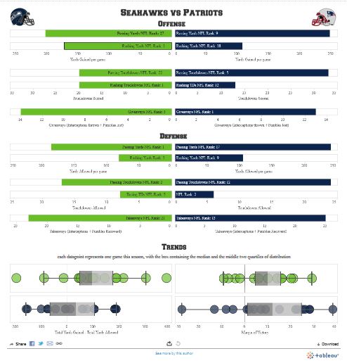
The first visualization (here) is called “HawksPats Stat comparison dashboard” and shows a graphical comparison of key team statistics for the Seahawks and Patriots, visually highlighting each team’s relative strengths/weaknesses.
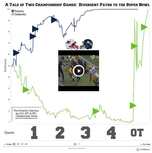
The second visualization (here) is called “A Tale of Two Conference Champs” and is a nifty recap of each championship team’s semi-final game. It shows how the probability that each team was going to win its respective semi-final match-up changed throughout the course of the game and includes video clips of plays that led to big swings in the probability.
Sign up for the free insideBIGDATA newsletter.


Speak Your Mind