 In this special guest feature, Ed Miller of DataHero discusses the importance of Google AdWords and the need to give marketers and advertisers the ability to create a rich set of visualizations for each available Google AdWords report. Ed Miller is CEO of DataHero and is a 25-year software entrepreneur with a track record in high growth markets and companies in their earliest stages. A serial CEO and entrepreneur, he has led several startups to successful outcomes, most recently Xythos, which was acquired by Blackboard Inc. (BBBB). He remained with Blackboard, contributing to their $1.64 billion acquisition by Providence Equity Partners.
Data from your AdWords campaigns is imperative to optimizing your strategy and ensuring your marketing budget is as efficient as possible. Whether you manage AdWords analytics for multiple clients at an agency or you manage AdWords in-house, the platform is likely a cornerstone in your digital marketing initiatives.
The problem is two fold. Most of us have a hard time visualizing what the giant table of AdWords information lays out for us. Dig any further into each campaign, ad group or ad, and it gets even worse. It’s extremely difficult to pull insights out of just a table of data. Many people are challenged to understand the benefits and the clear impact of AdWords on their business. Secondly, analyzing AdWords data alone simply isn’t going to give you the broader picture. You want to look at AdWords in terms of HubSpot and Pardot. Looking at the whole pie of marketing data and seeing how each slice affect the funnel is invaluable for outlining what truly makes the biggest impact.
So how do you pull insights out of this data? How do you ensure you’re maximizing reach while keeping spend as efficient as possible? The answer is with some targeted visualizations and dashboards that give you a comprehensive view of your campaigns and spend.
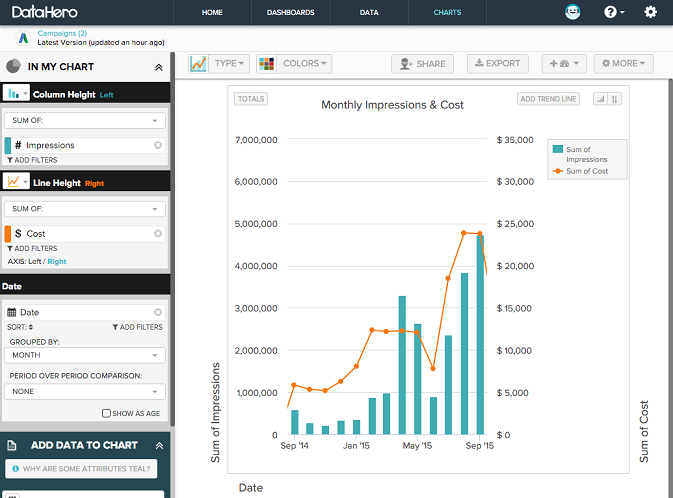
Monthly Impressions and Cost
The first place to start with your AdWords visualization is to create a chart that highlights impression count. While it’s crucial to monitor spend at a high level, it doesn’t tell us much about how effective this spend is. Visualize cost alongside the sum of impressions to see if the trend lines stay closely aligned.
Impressions by Campaign and Month
To build on your impression count and cost data, add in campaign data from Hubspot, Salesforce, Google Drive and Recurly to illustrate impression count by campaign. You can clearly see which campaigns are fostering the most impressions and which need some more attention.

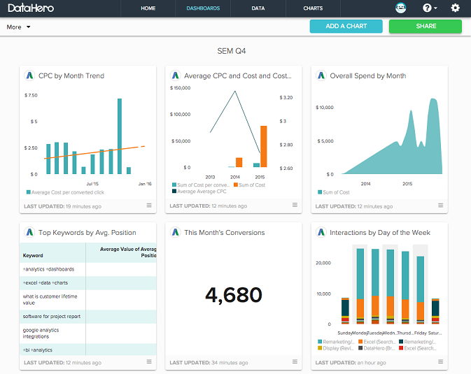
SEM dashboard
A Search Engine Marketing (SEM) dashboard, when designed properly, can offer an at-a-glance indicator of important aspects Pay Per Click (PPC) marketing strategies. These dashboards allow employees to combine charts from AdWords and Google Analytics, among others, and display important metrics in one place. The dashboard below includes charts spanning from Cost Per Click (CPC) by month trends all the way to interactions by day.
According to Moz, 80 percent of search results now contain AdWords ad placements. And as AdWords continues to gain popularity, reporting on results becomes even more complex and difficult. Any good marketing professional or digital agency should be analyzing AdWords in light of other marketing automation data. Marketing and advertising agencies need easier and more flexible tools to measure their AdWords data and combine it with other cloud data to identify the best ways to keep customers engaged.


Daniel,
I do not think many advertisers are using Google Adwords anymore…
Google has either banned most advertisers…
Or they made each search prohibitively expensive.
Google this:
List: 273 of the most expensive keywords in Google Adwords