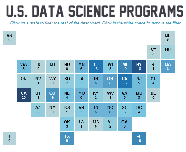
As more and more people seek avenues into data science as a profession, our Visualization of the Week offers a compelling high-level summary of the data science degree programs around the country. Using Tableau Public, data author Brit Cava provides an interactive data visualization that provides detailed information about the degree programs for each state. You can visit HERE to use an interactive version of the visualization. You can hover over various squares (states) on the Map to expose details about the distribution of degree programs.
Sign up for the free insideBIGDATA newsletter.


Speak Your Mind