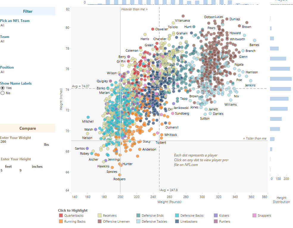
The new NFL has commenced! This visualization by Shine Pulikathara uses Tableau public to analyze the heights and weights of the NFL players for the 2015 regular season.
Visualization of the Week: Jackie Robinson vs. Everyone
April 18, 2015 by Leave a Comment
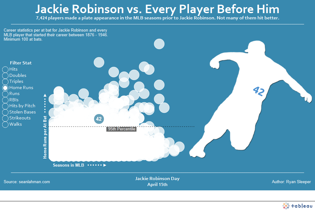
In honor of “Jackie Robinson Day”, our friend Ryan Sleeper uses Tableau Public to compare Robinson’s stats with every other player that came before him.
Visualization of the Week: Vaccine Preventable Outbreaks
March 4, 2015 by Leave a Comment
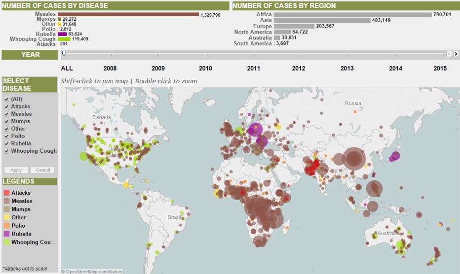
With the public’s attention on the recent measles outbreak, here is a compelling visualization authored using Tableau by the Council on Foreign Relations (CFR) — “Vaccine Preventable Outbreaks.” CFR maps vaccine preventable outbreaks since 2008.
Visualization of the Week: Gas Prices Across the U.S.
February 11, 2015 by Leave a Comment
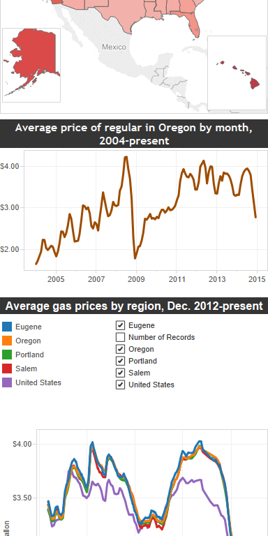
With a subject that affects most Americans, this week’s visualization comes from our friends at Tableau Public. According to AAA, gas prices are at approaching their bottom limit. Mark Graves of The Oregonian looks at gas prices across the country and in Oregon towns.
Visualization of the Week: Patriots vs. Seahawks
January 29, 2015 by Leave a Comment
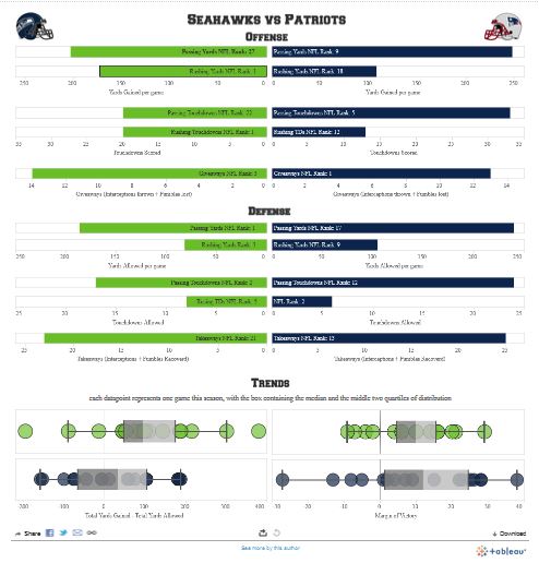
As a Superbowl treat, this week’s visualization is actually TWO cool interactive data viz apps about Sunday’s Super Bowl match-up between the New England Patriots and the Seattle Seahawks.
Visualization of the Week: 2014 Warmest Year on Record
January 20, 2015 by Leave a Comment

The visualization for the week comes from our friends at the Los Angeles Times, with their front-page, above-the-fold article in the Saturday, January 17,2015 edition – “Heat Hits New High: 2014 was the warmest years ever measured, confirming a trend.”
Visualization of the Week: #JeSuisCharlie
January 14, 2015 by Leave a Comment

Our visualization of the week comes from our friend, former Tableau Iron Viz contestant, Jonathan Trajkovic who reflects on the Twitter response to the recent tragedy in his home country of France.
Visualization of the Week: Turing Awards 1966-2013
December 22, 2014 by Leave a Comment
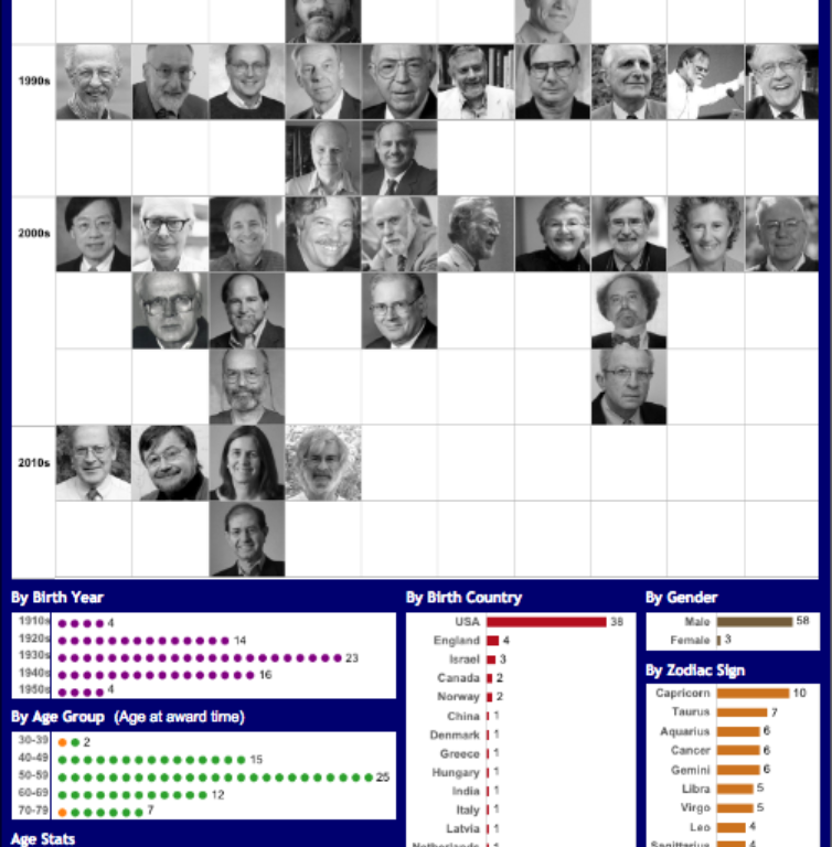
Alexander Mou of Vizible Difference provides the compelling visualization below showing the historical winners of the Turing Award – computer science’s most prestigious award.
Visualization of the Week: Cyber Monday vs. Black Friday
December 4, 2014 by Leave a Comment
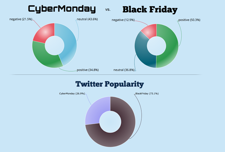
On the heels of the biggest online shopping day of the year for Americans, below is a big data visualization comparing Cyber Monday with its brick and mortar counterpart, Black Friday. The visualization, created by our friends at Datameer using its Hadoop-based analytics platform.
Visualization of the Week: Dueling Measures of Poverty
November 22, 2014 by Leave a Comment
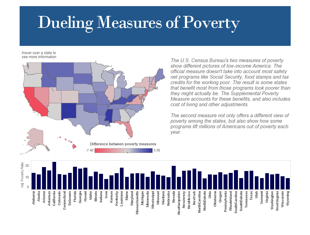
This new interactive visualization tells a compelling economic story based on U.S. Census Bureau data measuring the reach of poverty in America.


