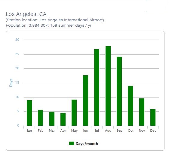
This week’s visualization choice was selected because it really hit home for me living in Los Angeles. Just in case you’re not familiar with our plight here in Hollyweird, we have a case of perpetual summer and severe drought conditions which when coupled together have produced a rather harsh climate in which to live.
Visualization of the Week: Uber Jobs by Country
September 18, 2014 by Leave a Comment
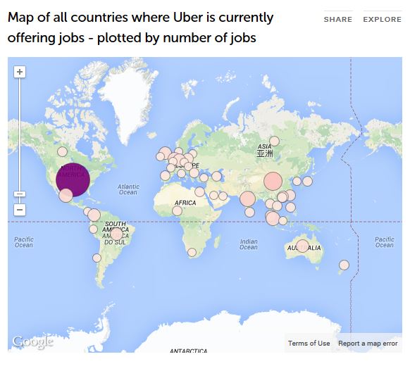
Here is a compelling visualization that shows countries where Uber is currently offering jobs. No jobs in Antarctica, darn, guess I’ll have to use a regular cab to visit my penguin friends.
Visualization of the Week: San Diego Comic-Con 2014
July 31, 2014 by Leave a Comment
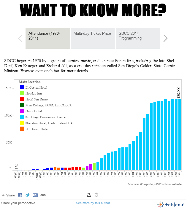
This visualization is especially meaningful to our Southern California readers who may have taken time off of their big data challenges to attend the San Diego Comic-Con. Our friend Kuang Keng Kuek Ser utilized Tableau software to visualize the attendance of this past weekend’s San Diego Comic-Con 2014. Click HERE to experiment with the live […]
Visualization of the Week: The Urban Observatory
July 17, 2014 by Leave a Comment
Last year, Richard Saul Wurman, @RadicalMedia, and Esri unveiled the Urban Observatory, which began the process of encouraging cities to use the common language of maps to understand patterns in diverse data sets. The next generation of Urban Observatory is making its global debut at the 2014 Esri User Conference in San Diego, July 14-18.
Visualization of the Week: Origin of World Cup Players
June 23, 2014 by Leave a Comment
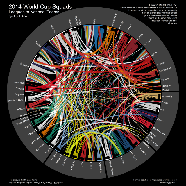
The World Cup 2014 is raging on right now, with many nail-biting matches to please enthusiasts of this global phenomenon. For this week’s visualization we’ll pair up data science and the World Cup by presenting a compelling new analysis that shows where World Cup players actually come from.


