 This week’s visualization choice was selected because it really hit home for me living in Los Angeles. Just in case you’re not familiar with our plight here in Hollyweird, we have a case of perpetual summer and severe drought conditions which when coupled together have produced a rather harsh climate in which to live (especially for someone like me with more of a Boston mindset). With the web app “Cool Maps with Awesome Weather Data Across 1,219 US Cities” that was developed by Kristian Nielsen of Honolulu HI 5 you can query a database of weather data to obtain:
- The number of days each month that have summer days in the range of 70F to 90F degrees – for over 1,200 US cities, towns and locales.
- The average rainfall and temperatures – all laid out by month – in those same cities.
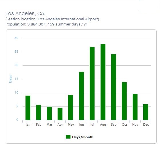
In the sample map below, you can see LA has summer days nearly half of the year!
The site runs on a Linux OS machine with the Apache web server and was developed in PHP using a MySQL database. On the front-end the web app is HTML5 compliant with jquery (for the interface elements). In order to insure the scalability of the whole platform, the solution is cloud-enabled on Amazon.
The weather data was collected from the National Climatic Data Center. Nielsen went through thousands of station points manually in order to identify the most suitable station to best represent each of the 1,219 cities for which there was data.
You can use the interactive map application yourself to check on climate conditions for your own area by clicking HERE.
Daniel Gutierrez, Managing Editor – insideBIGDATA
Sign up for the free insideBIGDATA newsletter.


Speak Your Mind