As insideBIGDATA’s visualization of the week, data author Jamie Laird uses Tableau Public to show us clusters of songs on the @whileyouwork Spotify playlist (MusicPlusData).
Visualization of the Week: Historical Global Temperatures
May 21, 2016 by Leave a Comment
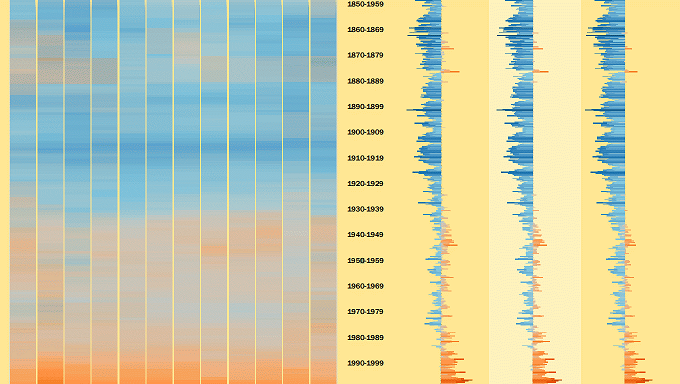
As insideBIGDATA’s visualization of the week, here’s a historical perspective of global temperature change from 1850-2016. The data is from USA Today and represent median monthly temperature differences from 1961-1990 baseline.
Visualization of the Week: 2016 Oscar Nominees
February 28, 2016 by Leave a Comment
As insideBIGDATA’s visualization of the week, here’s a look at the 2016 Oscar Nominees for Best Picture. Using Tableau Public, data author Andy Rudd provides a useful data visualization that ranks the movies by IMDB score and total nominations.
Data Visualization of the Week: The Age of Quarterbacks
February 6, 2016 by Leave a Comment
As the 2016 Super Bowl approaches, many are asking whether 39-year-old Peyton Manning can still win the game. Using Tableau Public, data author Jess Minton provides a useful data visualization that includes QB performance statistics by age.
Visualization of the Week: Interactive Map of Hong Kong Through the Lense of Instagram
February 3, 2016 by Leave a Comment
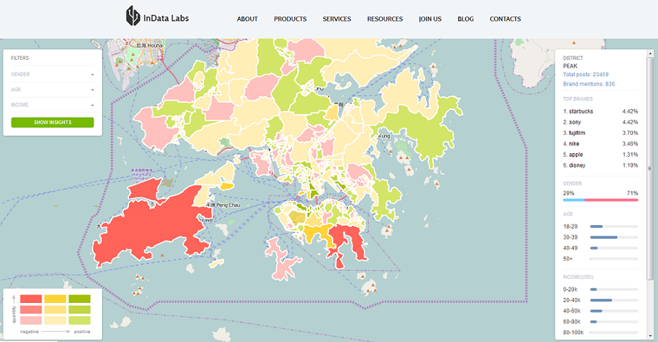
Our friends over at InData Labs with support of Datasia.hk provides our Visualization of the Week with an interactive map of Hong Kong that visualizes all the Instagram activity of the city. The map is telling a story about life in Hong Kong by showing who posts what and from which locations.
Visualization of the Week: U.S. Data Science Programs
January 28, 2016 by Leave a Comment
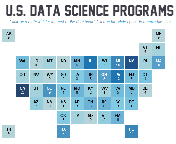
As more and more people seek avenues into data science as a profession, our Visualization of the Week offers a compelling high-level summary of the data science degree programs around the country.
Visualization of the Week: Presidents of the United States
January 5, 2016 by Leave a Comment
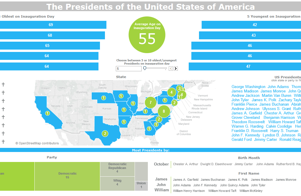
As next year’s U.S. presidential election continues to heat up, it might be useful to get a historical perspective for the Office of the Presidency. Using Tableau Public, data author David Pires provides an educational data visualization that includes statistics going back to the birth of the country.
Visualization of the Week: Driving Under the Influence Statistics
December 31, 2015 by Leave a Comment
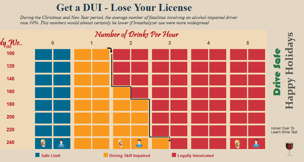
It’s that time of year when everyone must be more vigilant while taking to the roads. Using Tableau Public, data author Jambesh looks at Driving Under the Influence of alcohol (DUI) trends during the holidays.
Visualization of the Week: Steph Curry’s NBA Performance
December 12, 2015 by Leave a Comment
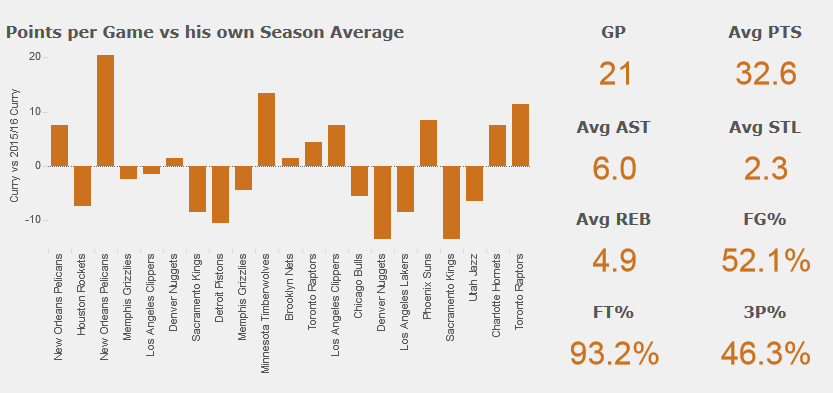
With the Golden State Warriors setting an NBA record for most consecutive wins to start a season it was time to have a closer look at Steph Curry. Using Tableau Public, data author Carl Allchin produced a compelling data visualization that encapsulates star Steph Curry’s performance on the court.
Visualization of the Week: Mass Shootings – America’s Gun Violence Problem
October 7, 2015 by Leave a Comment
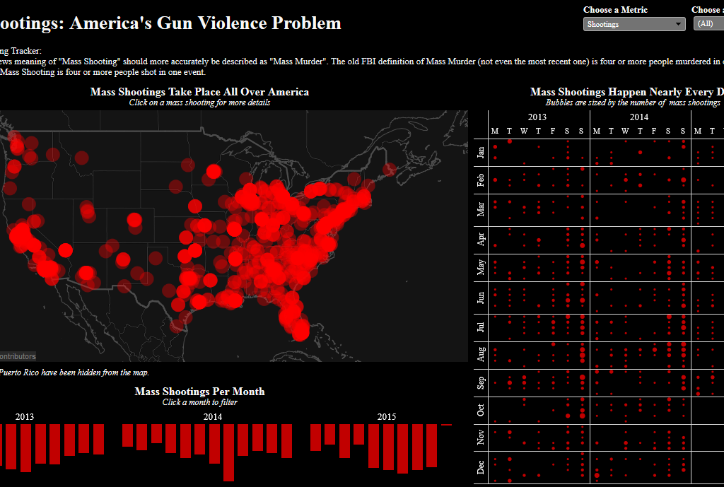
Mass shootings are now sadly a very common occurrence in America. This visualization by Andy Kriebel uses Tableau public to look at gun violence related events in the US.


